July 25, 2011

July 10, 2011
This weeks zentangles
 |
| Z 09 - I wanted a part of a tree as strings |
 |
| Z 10 before coloring and shading ... |
 |
| ... and finished |
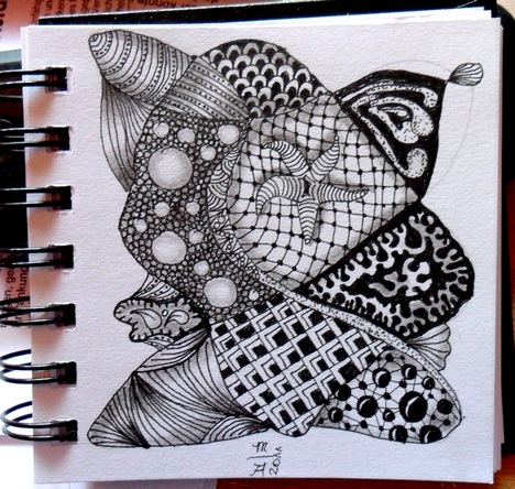 | ||
| Z 11 |
June 28, 2011


June 25, 2011
Tree in pen
My first pen drawing (neopiko 0.1)


Then colored with Caran d'Ache colored pencils,
grass done with Edding ink pen.
grass done with Edding ink pen.


June 23, 2011
Addicted
After a long long time withou art because Iwas ill I started over - and became addicted to zentangles. It is such a great way to train hand and eye and much fun.


May 27, 2010
The new Pencil Painting Network
Because we lost all dates and contents at the old place and because it is very expensive to keep PPN at NING running we moved and are moving to a new place.
You can find the new
.
April 24, 2010
Latest pencil paintings

"Fruit salad"
16 x 21
Rembrandt polycolor solved with almond oil

"Apples and Grapes"
ATC, Owner Angela Schingeck, USA
done with Cretacolor Karmina
October 06, 2009
Back into life
.... at least I hope.
Some might have been wondered where I've been the last month. The simple answer is I was sick.
Wow, I had no idea how bad one can feel over such a long time. But indeed it is or better was possible. I caught kinda gastritis - seems I had to much stress in life and soul for a while.
I could not bend my body to reach the keyboard or to draw (remember my short arms?) - just sitting on the sofa watching TV or lying in bed and THIS definately is not what I like.
Well, some days ago my husband gave ma a huge huuuuuuge huuuuuuuuuuhe incentive to make the last healing steps quickly, he registered me for Mike Sibley's online course at www.drawpace.com - believe me I was close to fall unconscious down to the floor seeing this. Sooooo happy!!!!!!
The course starts on Thursday and I can't await it!
And of course besides that I am glad to feel like a human being again - nearly. :)
Subscribe to:
Posts (Atom)