.... at least I hope.
Some might have been wondered where I've been the last month. The simple answer is I was sick.
Wow, I had no idea how bad one can feel over such a long time. But indeed it is or better was possible. I caught kinda gastritis - seems I had to much stress in life and soul for a while.
I could not bend my body to reach the keyboard or to draw (remember my short arms?) - just sitting on the sofa watching TV or lying in bed and THIS definately is not what I like.
Well, some days ago my husband gave ma a huge huuuuuuge huuuuuuuuuuhe incentive to make the last healing steps quickly, he registered me for Mike Sibley's online course at www.drawpace.com - believe me I was close to fall unconscious down to the floor seeing this. Sooooo happy!!!!!!
The course starts on Thursday and I can't await it!
And of course besides that I am glad to feel like a human being again - nearly. :)
October 06, 2009
August 20, 2009
Prisma lightfast vs Prismas Premier
Yesterday I received my very first Prismacolor Lightfast pencils. Only 5 but enough for trying out and comparing.
My first impression and my later as well is that I like them but they are definately NOT comparable to their little brothers and sisters the Premiers.
Lightfasts are in my opinion much harder and the pigment is not that willing to stay on the paper. I made a diect comparison with Premiers - means nearly the same colors were compared.
Also the solving with both oil and Zest-It was not that nice. And I had problems to apply enough layers to achieve a look I am used to get with my "cheep" prismas.
Maybe it's the colors I used (cobalt blue hue, canary yellow, raw umber, diox. purple hue, neutral grey 2) and I had bad luck to order just the hardes colors but however - after using and comparing these I am sure I'll stand by my Prismas and Pablos - both are much better! Maybe not that lightfast - but I do not care about it because my art is not that good or precious - it is a problem of the future generations to conserve and restore the "masterful artwork" of Mrs Alberts. <--- me.


In the meantime I've heard that Sanford stopped producing these pencils and the 'lightfast' pencils will be incoorporated into the regular prisma line.
My first impression and my later as well is that I like them but they are definately NOT comparable to their little brothers and sisters the Premiers.
Lightfasts are in my opinion much harder and the pigment is not that willing to stay on the paper. I made a diect comparison with Premiers - means nearly the same colors were compared.
Also the solving with both oil and Zest-It was not that nice. And I had problems to apply enough layers to achieve a look I am used to get with my "cheep" prismas.
Maybe it's the colors I used (cobalt blue hue, canary yellow, raw umber, diox. purple hue, neutral grey 2) and I had bad luck to order just the hardes colors but however - after using and comparing these I am sure I'll stand by my Prismas and Pablos - both are much better! Maybe not that lightfast - but I do not care about it because my art is not that good or precious - it is a problem of the future generations to conserve and restore the "masterful artwork" of Mrs Alberts. <--- me.
In the meantime I've heard that Sanford stopped producing these pencils and the 'lightfast' pencils will be incoorporated into the regular prisma line.
August 12, 2009
Barry, the cat
I started with the line drawing - oh no, I started with making a grid over the reference photo and THEN the line drawing! And surely I forgot to make a photo first I started with a first layer of Prismacolor Indigo. I used my Stylus for indenting the whiskers and some other hairs under his chin.
 I went on layering next layers of indigo and ultramarine and a little bit of black grape (I LOVE this color!).
 After I asked my friends on PPN they gave me some good tips how to do the reflecting areas of Barry's fur and so I added some slate grey and powder blue and a bit of true blue. I blended everything with almond oil.
 Black was added with heavier pressure at the dark areas and very light layers at the - guess where - lighter areas, right! Again some layers of the blues and the slate grey and again blending with almond oil. The ears got both two layers of Clay Rose and Light Peach and where blended with ......... ye - he - heeees - almond oil. While I blended the ears I could easily draw the black color with my oily cottonbud into the skin area of the ears so that it looks really like hairs.
I burnished most areas with white and then made the "pillow" (it's not a pillow but an upholstered lying surface of the kitchen-scratch-tree) with different reds and orange as a finish layer. and to stress my patience I of course had to do the background tiles of the wall (which is exactly so awry and crooked like it looks here. hm ... okay ... not THAT crooked...) with the same colors like the ear plus Peach. At last I added the shadow area with dark violet and indigo and a very light layer of black.
Now I call it finished although I could have done more on the wall tiles. The painting is not so bluish i.r. especially his top nose.
It was fun to paint this, especially because my 'model' sat besides me and watche part of the time while I was doing him. This wy it was easy for me to adjust the color of his eyes and so on. Here and there he tried to help me with dipping his tail into the oil and then to blend but I told him that I better o this. And this nice guy was NOT upset. ;)
 "Barry"
Size about 210 x 290 cm, Prismas on Canson "White Drawing Paper".
 I went on layering next layers of indigo and ultramarine and a little bit of black grape (I LOVE this color!).
 After I asked my friends on PPN they gave me some good tips how to do the reflecting areas of Barry's fur and so I added some slate grey and powder blue and a bit of true blue. I blended everything with almond oil.
 Black was added with heavier pressure at the dark areas and very light layers at the - guess where - lighter areas, right! Again some layers of the blues and the slate grey and again blending with almond oil. The ears got both two layers of Clay Rose and Light Peach and where blended with ......... ye - he - heeees - almond oil. While I blended the ears I could easily draw the black color with my oily cottonbud into the skin area of the ears so that it looks really like hairs.
I burnished most areas with white and then made the "pillow" (it's not a pillow but an upholstered lying surface of the kitchen-scratch-tree) with different reds and orange as a finish layer. and to stress my patience I of course had to do the background tiles of the wall (which is exactly so awry and crooked like it looks here. hm ... okay ... not THAT crooked...) with the same colors like the ear plus Peach. At last I added the shadow area with dark violet and indigo and a very light layer of black.
Now I call it finished although I could have done more on the wall tiles. The painting is not so bluish i.r. especially his top nose.
It was fun to paint this, especially because my 'model' sat besides me and watche part of the time while I was doing him. This wy it was easy for me to adjust the color of his eyes and so on. Here and there he tried to help me with dipping his tail into the oil and then to blend but I told him that I better o this. And this nice guy was NOT upset. ;)
 "Barry"
August 06, 2009
Latest CP painting
CP painting for a challenge at our Pencil Painting Network.
Prismacolors blended with almond oil on Canson *Pure white Drawing' board. Size 210 x 110 mm

Homebakery
Prismacolors blended with almond oil on Canson *Pure white Drawing' board. Size 210 x 110 mm

Homebakery
July 30, 2009
Please help to help
Today I came over this article - it is a bout an abandoned cat that must have been treated very bady because her tail must be amputated.
Sarah Bohr, the woman, who feeds her is a friend of one of my best friends and has a blog, where we can see the littlle Kira. Go here!
Please have a look yourself and visit her blog and watch Kira. She is a very sweet black cat and needs help.
I know how it is to wish to help a cat - we have nine, all rescued from the street. And so I gave Sarah a little bit to help Kira and I hope many people will do so too - and spread out that Sarah needs help, this also is a huge help.
Sarah Bohr, the woman, who feeds her is a friend of one of my best friends and has a blog, where we can see the littlle Kira. Go here!


Please have a look yourself and visit her blog and watch Kira. She is a very sweet black cat and needs help.
I know how it is to wish to help a cat - we have nine, all rescued from the street. And so I gave Sarah a little bit to help Kira and I hope many people will do so too - and spread out that Sarah needs help, this also is a huge help.
July 28, 2009
Great news
As some of you know since some days the member show at Ann Kullbergs magazine "From my perspective" is online and I am so excited, so thrilled and happy to announce that my wonderful friend Juno has won the first price for her pencil painting:

"Opulence"
by
Juno Kughler Carlson
Juno is not only a wonderful artist but a wonderful warm and caring friend and she deserve this price very very much.
You can find her website here:
She also is a good writer and if you want to read about her not even easy life, her father who also was a wonderful artist and much more visit her blog
It is well worth to visit both and to have a look at her amazing pencil portraits.
July 14, 2009
Honored?
Some time ago I started a request at STAEDTLER - you know - the pencil producers who make clutch pencils and the mechanical pencils I use.
I wanted to know some special things about their clutch pencils and the difference between graphite, polymere leads and their mars micro carbon. I received an answer via email with the explanation and a big compliment on my drawings (I added a link to my gallery at PPN)
And via snail mail a pencil!
Wow! What a really nice company! Unfotunately the pencil was not that good for me to use - it has a triangular grip which is not useful for me because I always turn my pencil some millimeters to have a sharp point at anytime. Except I ant to have a chisel edge. ;)
But the gesture is so great and I said thank you and explained them why this pencil is not good for me. I received an answer where they said that it is a pity and so on but they will send me another pencil to try out. Another wow!
Is this cool or what! But it comes much better:
They also asked if I would be so kind to make a drawing for their Bureau. Oh - and guess what I said...... Yes of course! LOL
Maybe this doesn't mean much but first it is only fair to gift them a drawing for they gave me two pencils (the second one isn't arrived but I received their second email yesterday) aaaaahaaaand - to have a foot in the door of or contact to a company that produces pencils can be helpful - or what do you think?
Here is the pic - it is an ATC done with their mechanical pencils with leads 2B, B and 5H and a kneaded and an electrical eraser.
July 12, 2009
A portrait
Last days I felt pretty much adventurous and good regarding drawing after repeating some excercises from Betty Edwards book "Drawing on the right side of the brain.". So I decided to try my hands on a self portrait. and I must confess that I am very satisfied with the result.
Of course I already posted it at PPN and my friends there said that it is a good sketch and nicley done, but I MUST work on achiving better likeness. Gosh - I was sooooooooooo sad...............
Do you all too think that I have to work on the likeness?
.
.
.
.
.
.

:-)) ;-))
Of course I already posted it at PPN and my friends there said that it is a good sketch and nicley done, but I MUST work on achiving better likeness. Gosh - I was sooooooooooo sad...............
Do you all too think that I have to work on the likeness?
.
.
.
.
.
.

:-)) ;-))
July 06, 2009
My artists of the month
Two nights ago I couldn't sleep because of a very loud party across the street and so many thoughts played around in my head.
I suddenly had the idea to show paintings and drawings of artists I like very much. I know many artists do so butI think it won't hurt anyone if I also have my "artist of the month". And because I ALWAYS must do anything in a different way I think I nor will have an artist of the month neither one of the week.
No. I will have two artists of the month - one colored and one monochrome artist. (ROFL - sorry for the play with words)
The artists for this month are Juno Kughler and Doreen Cross.
Juno Kugler Carlson
(color)
(color)

Juno Kughler: 'Indian Girl'
This amazing and outstanding portait is done with color pencils and ATC size (2,5" x 3,5") that she has sent to me. Because I'm holding it my own hands and have a real look on it I can say that this is one of the best artworks I ever saw. You can't see any pencil strokes, everything is perfect and I am very proud to be a owner of a "Juno Kughler Original"!
If you want to see more of her artwork or if you want to read about her you can visit her homepage JunoKughler.com or her blog Looking Glass hours. Btw - she is good writer too.
If you want to see more of her artwork or if you want to read about her you can visit her homepage JunoKughler.com or her blog Looking Glass hours. Btw - she is good writer too.
Doreen Cross
(monochrome)
(monochrome)

English House by Doreen Cross
Dors also paints with colored pencils and other mediums but this month she is my monochrome artist. :) I love especially her house drawings like this one here:You can see more of her artwork at Dor's Fine Art and on her blog Dors Art. She has many wonderful drawings and paintings to show.
________________________________________________________
I hope you like my choices for this month.
If you know an artist who should be the next "My Artist Of The Month" - no matter if it is you yourself or a friend or one whose artwork you like please send me an email at cp-art@t-online.de
July 04, 2009
New leads, new luck
Yesterday I received my CretaColor leads and I must confess that they are the cheapest here - and I like them best ever!!
It is real graphite, no polymere, no synthetic or whatever leads are made of. The softer leads like 4B and 6B are REALLY dark and the harder one like 2H, 4H and 6H are wonderful to blend and light but not scratchy. I love them!
The following pic is done with a 4B lead exclusively. I wanted to try our a Tromple L'oeil drawing for a long time but never had enough "yes-I-can-feeling" to start. Yesterday was a pretty good time, hubby had a nap and I felt like trying out my new leads on a drawing, not only on maling another grey scale LOL.
 I used that 4B lead in a Staedtler clutch pencil (my favorite brand for lead holders), a pencil eraser which is also new and my beloved electric eraser on Hahnemuehle 'Nostalgie' (smooth sketch block).
The graphite lead was really really nice to draw with. I could achive dark deeps and also light layers of grey.
Of course this drawing isn't finished yet but so far it was huge fun, especially because I achived what I wanted to with this lead.
I don't know why I didn't like mechanical pencil - clutch pencils - before, they are wonderful easy to sharpen either with the F-C mini-lead-sharpener or with the Dahle lead sharpener, which I also have since yesterday.
 Woooo - I had huge problems to figure out, how the Dahle worked and this let me break into perspiration. But close before I wanted to throw this d.... thingy into the next corner I noticed how I have touse it. So easy! But I needed more than 10 minutes to understand. Gosh - how can one single darkhaired woman be so blonde!?!?!?
Okay, I still have no idea for what the little wholes right and left are good for - but main thing is the sharpener is doing his sharpening-job - and it is doing this phantastic.
June 27, 2009
Just a drawing
I changed my opinion, Mikes book is definately not overprized. It is great and immensely helpful. Call it expensive, but it definately is the heavy-weight champion of all graphite drawing instruction books.

Although I still only have read about 110 pages I can see a change in my work. I made a drawing - rather a sketch, for the Pencil Painting Network that Dors this time managed and hosted and found Mikes hints and tips very helpful.
Even my husband, who is my hardest critics, was astonished and amazed when he saw the picture.
I know it is no masterpiece, but I am VERY satisfied. I see where I could do more shadow areas and where I could push the darks but the paper (W&N cartridge paper - too smooth, but not bad) didn't take more layers.
I used Staedtler clutch pencils 2B and 2H and a Prismacolor woodless graphite pencil 8B (*sniff* - my last one).
And an electric eraser to lift out graphite for the tree and the branch. and some dots on the ground. LOL
It was so much fun - I think I'm back to the roots - to graphite.
June 20, 2009
Mike Sibley's book Part II
Okay. I now have worked through the first 40 pages and I like what I read so far.
What I like very much is that in his paintings there are rarely the pencil strokes visible, you know what I mean?
Some artists only work with strokes, bigger, finer, heavier, lighter, hatched, cross hatched, all visible strokes. Mike prefers to see not the single stroke and this is what I like.
And another thing was remarkable for me. Mike mostly uses clutch pencils but I never liked them and preferred wooend case pencils. I do not care if the weight in my hand changes. But I gave the 'Clutchers' another chance to become friends with me. And - tadaa - we became close friends.
I had the chance to purchase five clutchpencils made by Staedtler for 5 $ - which is VERY cheap here - and some leads (F-C). I already had mechanical pencils and bought some GOOD leads for them also - and I can't believe why I didn't used them before.
It is much easier - no sharpening or only sharpening the lead with a tiny lead sharpener (F-C) which I can hold easily. The leads I bought are wonderful also. I have no idea if the Staedtler leads are very different or how, but I am satisfied with these clutch pencils and their 'fill-ups'. :)
Btw - if someone wonders if there is a difference between clutch püencil made by Faber-Castell and Staedtler: Yes, it is - the F-C clutchers have MUCH more weight and the clutchmechanism is very much harder to use.
So I already benefit from the book. Joanie, a close friend, mentioned at PPN, that she finds the price too high and I I think too that this book is a little bit overpriced (not my reduced copy). But when I compare it with the books we can buy here in Germany where we have to pay 16 $ for a tiny brochure size A5 (140 x 210mm) and not more than 40 pages with big letters it is cheaper than everything in Germany. In general seems Germany to be a developing country concerning pencil art, especially colored pencils.
So Mikes book is much more worth than these - how much I will know when I go on. And he is an outstanding artist, very well known and maybe the name raises the price too.
I guess there are many books about drawing in USA and UK which are at the same level and cost only the half or less. Can you recommend good books on graphite drawing?
.
June 19, 2009
I'm a Fan!!! (Part I - Music)
I'm a fan! I am a fan!! I am a huge fan!!!
As usual in that show bands come and play their music and so this time too. The talk master announced that group but I was very busy with a drawing on my leap so I didn't hear much about their introduction. But suddenly my ears got as big as Dumbo's ears!
There was a sound that made me swing and jump and I couldn't believe my ears and also couldn't keep my pencil calm and controlled in my hand because this pencil suddenly seemed to have an own very swinging life.
I looked up and saw three very cute guys dressed as we'd have the 50's - and so was the music. "Umbrella" - everyone knows that song - as Elvis would have sung it.
Great! Phantastic! Amazing!
Hubby and I looked at each other - a wide smile in our faces and jumping and teetering on our couch. We both have a very different music taste - he likes german music and is a huge Elvis fan. I also like our King ofRock but apart from this I'm 70's/80's girl and a rock fan, I love Lighthouse, 3DoorsDown, Nickelback partially but also some Jazz.
But this music is for both of us - I myself think "the baseballs" fill in a gap and bring different generations together.
I am not used to buy CDs very often but the next day I ordered their CD - and unbelievable but true: Every single one of 12 songs is cool! This happens to me very rarely.
In the meantime I saw another interview with "the baseballs" and the boys are really very cute and very heartily and friendly.
Digger, Sam and Basti, you guys are great!
Now have a look and enjoy:
June 16, 2009
GOT IT!
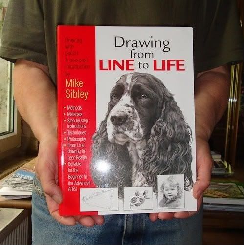
Since a long time I dreamt to have Mike Sibleys book "Drawing From Line To Life". Although I know it is good to let money roll I sometimes have problems with letting roll too much for a single product.
 *******
 *******
 ********
Short words: Mikes book is really expensive. 35 GB Pound plus Shipping is a lot. But as a subscrieber of his site I now received a newsletter with special offers of copies with little cosmetical mistakes so I could save 10 Punds- 12 Euros. Of course I grabbed this chance and purchased my copy!!
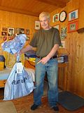
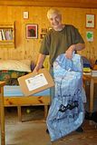
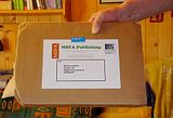
Mike wrote in an email that he will send the book next day and that I should look out for a big blue postbag. I had no idea that he meant huge when he said big:
 *******


 *******

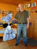
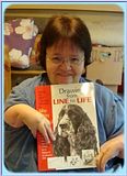
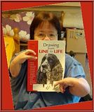
Okay, this all was my husband - first because I am a better photographer and second there is a little thingy about me which is not dramatic (for me) but I am not used to talk about it if it is not necessary. But at PPN - our Pencil Painting Network friends asked me my husband presents the book and not I myself. See reasons above. LOL
But I think it is time to say that I am kinda handicapped. I was born with a malformation of my limbs because my mother took a pill with name Contergan. In UK it was called thalidomide and worldwide more than 10000 babies where born with malformations, most died and the most who still live have long legs. I don't. ops - no - I mean of course I surely live but I also have no legs besides my short arms.
Okay, this is what might be important. But I hope this will touch you as much as it touches me and my life - nearly in no way. Of course I have my borders but they are less. As you see I had huge luck, got a wonderful husband, studied, can drive my car (If I would have one LOL) and have a happy life. I can do nearly everything except walk, ride a bike or wash the windows (but honestly who'd miss THAT?) and as you know I can paint and draw - not more or less.
So please please my friends, don't feel "urgh" or "argn" - just be like you always are. :))
 ********
June 06, 2009
Drawing day 2009
Today is DRAWING DAY!

Let's try to draw over a million pics today. I'm in - who else?
My drawing or maybe it will be a sketch only will be posted later on here.
June 03, 2009
Ouch
Because I hurt my finger (it thought to have a little fight against a door knob and lost...) I couldn't do any artwork for a while. But some homoeopathics and a little resting helped a lot and now I can show two pic - one finished for a challenge at PPN and another one for my own pleasure.

I used my beloves Caran d'Ache Supracolor pencils - dry - in combination with a black Faber-Castell PITT Artist Pen and a dark green Staedtler pen. I wanted to try out such a cimbination for a long time and I must say that I'm pretty satisfied with the result.
Her is the finished one:
*****
Then I started a picture I grabbed from a journal that I'd modified the way I wanted it. Again I used my Supras, this time on Clairefontaine Pastelmat (light grey).


Before .....
... after adding water.
To be continued.....
May 20, 2009
A win and many ATCs
Wow. The last time was pretty much exciting.
At PENCIL PAINTING NETWORK we had our first ever ATC exchange with ten people who traded. It was and still is very exciting because nobody knows from whom he/she will receive an ATC (except me and my hubby who has drawn the names).
It is huge fun! These days all the little artworks are reaching their new owners and I am happy that mine arrived yesterday. It is from Ulrike and a very beautiful rose. Look:

The ATC I've done also reached it's goal and the new owner is MJ.

We will have our next ATC exchange in June and so many people have joined in that new trade yet. Making me proud and happy. :)
But the best: I have won!!!!!!!!!!!!!!! Gosh, I was so surprised when I got the mail that am the monthly winner of "ATCs for all" with my "Earthlove" :

I am still over the moon and everything. It is the first time for me to win something and I feel so much honored because it was the choice of all the members of ATCs-for-all. Can you imagine how happy I am? I'm sure you can. This is so much encouraging, more than every single word from a professional critics.
May 07, 2009
Kristy Kutch on WCPs
Many Thanks to Kristy Kutch for this article and letting me post it.
.
Potpourri of Watersoluble Pencil Traits and Techniques
by
Kristy Kutch
Watersoluble colored pencils are beautiful, fun to use, controllable, and surprisingly speedy. Frequently an artist has a set of them tucked away in some corner of the tote bag, not quite sure of how to use them. (Been there, done that!) Below are some ideas for handling those watersoluble pencils and enjoying their exciting potential.
Watersoluble Pencils Include Watercolor Pencils- Plus New Varieties
Originally, the watersoluble pencil was a watercolor pencil, featuring a rod of watersoluble pigment-plus-binder neatly encased in a wooden sheath. This type of pencil is widely available and offers plenty of exciting, vivid possibilities and a tremendous range of colors.
Cretacolor of Austria produces a watercolor pencil tapered rod, a very dense, heavy aquamonolith which is all pencil-product and no wood casing. Cretacolor also has introduced (in 2008) Marino watercolor pencils, lightfast watercolor pencils in 36 colors.
Cretacolor also markets a range of watersoluble graphite pencils, which apply like graphite but which dissolve into grey washes when wetted.
British Derwent Watercolour Pencils were available for many years in 72 shades, each hue corresponding to one of their wax-based Studio Pencils. Recently, though, Derwent has expanded the definition of watersoluble pencils, adding 24 colored graphite pencils, Graphitint Pencils, to their line. These can be used dry or wetted with a brush for surprising hues-that-pop.
Another unique Derwent pencil is the collection of 72 Inktense Pencils, described by the manufacturer as the first watersoluble ink pencils. Inktense pencils are quite vivid when dry and stay brilliant and vivid after being dissolved. They are also more staining and permanent than watercolor pencils (so watch that white shirt or blouse!) Jane DeMeyer of Oconomowoc, Wisconsin created a stunning Hawaiian sunset with Inktense pencils which truly showcased their vivid intensity.
How to Use Watersoluble Pencils
The watersoluble pencil may be used for dry drawing and left completely dry and textured. (It is not possible, however, to sharpen it to a needle-fine point like that of a Verithin pencil.) It also can be wetted with a solvent blending-marker, which releases the pigment so that it looks a little grainy but mostly dissolved. The most stunning effects can be seen when the pencil layer is wetted with a damp brush or spray bottle, allowing the pigment to transform into a dissolved wash. Watersoluble pencils can also be drawn heavily onto a spare piece of paper to make a homemade palette, wetting the swatch and dipping the brush into it for painting details right from that custom-mixed puddle of pigment. There are other possibilities for drawing with a wet pencil tip into an already-wet area for a streak of intensity, drawing dry into a wet area for a finer "shot of color", spattering the wet pigment with a toothbrush for a loosely airbrushed look, and grating the pencil pigment onto a damp area for some dynamic, intense grains of color.
Another consideration is to apply the watersoluble pencil(s) on a white surface, brush over the pigmented layer with a wide, wet brush, and thus tone (tint) the drawing surface. This do-it-yourself color selection is especially helpful to the artist who would like to find a certain shade of colored paper or board which is simply not available. Gail Ribas of Acadia Workshop Center in Southwest Harbor, Maine, paints dynamic landscapes in pastel, watercolor, or colored pencil. She said that often she often begins by toning her white paper or board with a shade of orange, then proceeds with blues for the sky and water over that orange surface. The underlying orange complementary color (the opposite color on the color wheel) adds an amazing, vibrant "pop" to the landscapes and surprisingly does not "scream" orange at the viewer. (This surface-toning process would be a good application for the more permanent Inktense pencils.) Of course, the white drawing surface could be tinted blue, lavender, green, or any other desired color.
Watersoluble pencils can be used for interesting background effects, too. Protecting the drawing of objects in the foreground with frisket film (cut in the pattern to cover it), then spattering with a toothbrush is one option. This creates a loose, pleasing background that I have nicknamed "poor man's airbrush". Yes, it is certainly a good idea to practice it on scrap paper first. Learn to dab off the toothbrush at least 4 or 5 times to control excessive drips. Once mastered, though, it is fun and unique.
Recently, while I was finishing a coastal scene, my ocean waters looked too placid against those rugged boulders. (Although it was a calm day, the scene still needed some artistic license and begged for a little action!) I worked upon an idea (once suggested by a student during a demonstration) for that sea-spray that rises up from white-capped waves. This technique for foamy wave action is quick, fun, and quite natural-looking. After the water was drawn and developed almost to completion, I carefully flicked some clear water (with a soft toothbrush) on the crest of a wave. Then I quickly grated my white watercolor pencil over the tiny wet dots and the white pencil granules clung to them just like sea foam! I even added a little grated pigment in an aquamarine color to that white foam, plus a light shade of ultramarine blue, to give the froth some depth, subtle shadows, and dimension. After this process, I allowed it to dry and then sprayed the whole piece with a fixative spray.
Many years ago, as a beginning watercolor student, I truly struggled with lifting dry watercolor pigment by dragging a kneaded eraser across the area. Sometimes it worked and sometimes it was futile, depending upon how staining and permanent that particular pigment happened to be. A white plastic eraser works much better, I have learned. A battery-powered white plastic eraser is amazing for lifting dry pigment! (Do not try this when any part of the painting is still damp, as those flying eraser crumbs cling to wet areas!) Just remember to let the paper dry thoroughly before erasing, so as not to damage, gouge, or scar it.
A new valuable hint (which I recently learned from www.wetcanvas.com ) is for gently lifting an area to be lightened with a damp Mr. Clean Magic Rub Eraser. This is a cleaning product commonly found in the grocery store, and it costs about $2 for a package of 2 Magic Rub Erasers. It does not require the artist to scour the painting surface, just lightly brush across it. Rinse the eraser, blot the surface, and repeat the process if necessary. Be sure to purchase the original, no-frills version of this product, not the one with Febreze added.
Note: Newly accepted under the definition of “colored pencil” by the Colored Pencil Society of America are watersoluble crayon products. Most frequently mentioned are Caran d’Ache Neocolor II (126 colors), but the (discontinued) chunky crayon-like watersoluble Stabilotones are included, too. I contacted the C.P.S.A. national board about whether Lyra Aquacolors (48 colors), Cretacolor Aquastics (80 colors) or the discontinued Faber-Castell Aquarelle Sticks (40 colors) also fall under this definition, but have not received a reply. I am assuming that “no news is good news” and they they are colored pencil products, too, since they seem to be similar products.
May 04, 2009
Long lazy weekend ....
I haven't done much artwork the last days. There are days where I better don't touch a pencil or something with which I could ruin a painting. *lol
But I took a great photo (at least I love it and must laugh when I look at it). Some of you know that we have 9 cats, all former street-kitten who lost their mothers. In 2003 we picked up a twin pair who was only about 14 or 17 days old (eyes just had opened). The yearned and yearned about 200 metres away from our home but I heard them - whyever. Hubby and I went there and found these two babies - crawling on the street!  The neighbours there said that the mother was away and one sibling already killed by a car - but "we don't care, they are old enough and will survive, we give them a little milk." They couldn't even walk and because of hunger they where on the street - Gosh - I was such angry.
So we picked them up, both where not very healthy because of so much unger and milk the got. But we made them healthy (thanks to homoeopathics and a good vet later) and of course they still live with us.
The twin brother is a great "washer". He loves to slick heads, especially hubbies head when he sleeps. And you know how rough a cats tongue is. But hubby "nothing-can-disturb-my-TVsleep" didn't notice that mostly. Yesterday I had the chance to take a photo of these two pretty guys. :) Look:

sometimes a good photo is better than a ruined piece of art. 
At PPN we just have our first ATC exchange, I am very excited and hope that many of our members will participate. I love these ATC trades, it is wonderful to send and to receive these tiny artworks from all over the world. If you feel the same come and join us, our network is growing every day and I am very proud to be a member if the pencil painters!
April 28, 2009
Two ATCs
I hadn't much time the last two days for doing much art - and also not for going on with my farmhouse or the castle or the still-life - but I felt like doing something quick so what's better in this case than an ATC!
I did these two - kind of phantasy art or whimsical or .... I have no idea how to name this style.
"Seahippo"

"Earthlove"
Both are done with Cd'A Supras wet and dry on clairefontaine pastelmat.
April 23, 2009
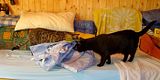
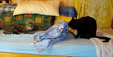
Thirsty kitten
Don't think that I have the bathroom for my own - our youngest cat always hurries to the bathroom when she hears that someone is in there. Either she occupies the toilet bowl so you could get some tiny problems or if you want to wash your hands she already is there.
And the running water it is her biggest joy:
And the running water it is her biggest joy:
April 22, 2009
Update farmhouse and more
Just a quick update without many words:


Farmhouse:
The pears and grapes with Supracolors:
April 18, 2009
My new CPs
Okay - now it's a fact: I'm one of thoose people who must have every kind of pencils that are produced on this planet. But I fear I also would buy a set of "Moon-Made-CPs" or "CPs dine by little green people from Mars".
However - my new set is the full set ofSupracolor II Soft
and I have to confess: BEST EVER!
I never thought that I would say that but there are pencils that are better than Prismas. At least in my eyes. (Ouch! I better say in my hands.) Now let me say a bit about them.
First the facts:
o Supracolor are made by Caran d'Ache, a producer in Switzerland.
o They come in a range of 120 colours.
o They are watersoluble.
o They are wax- and oilless (this word looks strange, or not?) so they have no wax-bloom or glossy shine.
o They have the same color chart as their "siblings" Pablo, the oil or waxbased CPs made by Caran d'Ache
The lightfastness is very good:
# - 7 of 120 pencils have one star = good lightfastnes
# - 66 of 120 have two stars = very good
# - 47 of 120 pencils are rated with three stars = excellent!
They are wonderful soft and easy to layer. If I want to solve I simply can use water instead of Zest-It (although I love it) and the colors are wonderful - dry AND wet.
This is for example a huge differerence to the inktense pencils. Inktense only show their real colour and beauty after applying water - these watercolour pencils are also dry beautiful.
I'm doing a still-life on two different surfaces - Clairefontaine pastelmat (sienna) and Bristol Board (ATC size) - because I want to know how these pencils behave on the different mediums. The feeling on both is wonderful and I can layer and layer. On the bristol board I use the pencils dry and on the Clairefontaine I added water. (Great surface btw for dry AND wet! I will talk about it another day.)
This is what I have so far:

.
April 14, 2009
An apology
Oops.
.
.
.
I am so sorry - how could I forget the wonderful Scribble talk????
Years ago I joined in there but then the place there became a bit more quiet and I used more other media than pencils.
Teresa mentioned it and I am so happy to have it back because it is a wonderful community for pencil painters. Have a look at SCRIBBLE TALK - it is well worth.
And a special Thank You to Teresa Mallen who brought this back in my mind. Btw - visit her blog, she is an amazing artist and a wonderful encourager and motivator!
.
.
.
I am so sorry - how could I forget the wonderful Scribble talk????
Years ago I joined in there but then the place there became a bit more quiet and I used more other media than pencils.
Teresa mentioned it and I am so happy to have it back because it is a wonderful community for pencil painters. Have a look at SCRIBBLE TALK - it is well worth.
And a special Thank You to Teresa Mallen who brought this back in my mind. Btw - visit her blog, she is an amazing artist and a wonderful encourager and motivator!
* * * * *
Still-life and a discovery
Last days I tried out Caran d'Aches Supracolor Soft pencils. I bought them about one or two months ago (lucky shot) but never used them.
But now I decided to give them a go and I am totally thrilled. I started a still-life with my Prismas (outline and a little layering on the candle-holder) on Clairefontaine Pastelmat (coloured) and then went on with the supracolors.
I added different layers on the candle-holder and the apple, wettened the colour, let it dry and then added more layers.
It was huge fun to work this way and the surface seems to fit perfect.
This is the reference I worked from. I took this photo two years ago in autumn so it is more an autumn picture but who cares....


* * * * *
April 08, 2009
Juicy Dura-Lar :-))
Some days ago hubby seemd to miss me. *lol* I was busy with drawing and didn't watch the time so hubby asked me if I was in the wide wide universe *lol)
I laughed and answered 'No, just spending time with an orange or better a photo of an orange from Alyona Nickelsen's CP book.
I am not that enthusiastic about her book, I expected more if I'm honest. Although when I started to read the book I thought it is phantastic and it definately has some very good chapters on composing and color theory and so on. And of course it is good if you haven't seen other CP books before like Ann Kullberg or especially Janie Gildow.
However - I started the orange from her book - but my own way (I have no solvent yet - will come in a few days). And - I used the very first time Dura-Lar. It behaves very different from eg Stonehenge paper or Bristol board, doesn't take so many layers as I'm used to apply but -------------- I LOVE IT!I made some mistakes but I am pretty satisfied with the result.

************
I now darkened the left peel. I'm not sure if it is better now or if I ruined it.

April 03, 2009
Invitation
For some reason I had to delete the link to a big art community (I draw and paint) and I also will leave this place there.
Art is a wonderful thing and we should be free in our art. Especially when we belong to a community. Nobody is allowed to tell us how many artworks we do or show to other people.
.
Nobody is allowed to set people under pressure a determine to make comments and nobody should be allowed to kick one out of a community if he or she doesn't follow rules like I just mentioned. A community that allows admins a behaviour like this and even support it is not worth to be a member there.
.
There are many good communities like Wet Canvas, Let's make Art, Craft Crowd, Give your walls some soul and so on which are worth, very well worth, to join. But I haven't found any community for CP artists so I now will try to start one.
It is called
.
There are many good communities like Wet Canvas, Let's make Art, Craft Crowd, Give your walls some soul and so on which are worth, very well worth, to join. But I haven't found any community for CP artists so I now will try to start one.
It is called
.
.
and it is open for every artist who work with a pencil - CPs in every variation, graphite as well as ink. There are no rules except to be kind and friendly to each other and to enjoy and have fun.
.
If you are interested, have a look at it or join in. Like everything it takes time to grow but just have a look - it is for free ;-) .
.
.
I would love to see you there.
.
March 31, 2009
Farmhouse - update IV
Spring is back! :-)
Yesterday hubby, Nellie and Justy (our dogs) had a long walk in the pretty warm sunshine and it was such great to refill the skin with sunlight.
This morning it seems that we'll have a rainy day but that's okay - nature needs rain for waking up all the blossoms.
I worked a little bit more on my farmhouse and now - step by step - I feel a little bit more satisfied.
I fixed the bad perspective a bit and added greens and blues to the background trees.

For the most of us drawing/painting is kind of balance for the daily life we all should be free in our art. Drawing and painting what we like is one of the most satisfying and wonderful things.
March 26, 2009
Farmhouse - update III
Some days ago I was so happy - spring had come and it started to be warm and cozy outside, the sunshine was bright and warm and promised to feel very good being outside.
Yesterday morning I woke up and couldn't believe my eyes - our whole garden was white and my nose felt like an icicle. Coooooooooold!!!!!!
Winter had come back. Oh how I hate to have cold and snow again but the good thing is that it won't take long until we have springtime and summer - and we all complane about the heat. *lol
After a pretty long time I at least had a little time to work on the farmhouse. The tree still gives me a little headache but I now let it flow and hope the best.

°*°*°*°
While sitting on our sofa and watching TV (with a cat on my lap and besides me on one side. On the other side snorkling hubby and a dog besides me *rofl*) I started a drawing. The "reference" is from mind, I once saw a painting similar to my drawing and tried to remember it and bring it to paper.


Subscribe to:
Posts (Atom)